PV | Work
PETRA VIDONJA

Prva Zdravje

Insurance Ecommerce Platform

Designing a clearer digital experience for exploring health insurance packages and completing the purchase process online.

UX / UI DESIGN · ECOMMERCE · INSURANCE

Responsive image

Project overview

CLIENT: Prva Osebna Zavarovalnica · via Madwise d.o.o.
ROLE: UX / UI Designer
YEAR: 2020
PLATFORM: Responsive website
FOCUS: Information architecture, insurance purchase flows, UX/UI design

The challenge

Purchasing health insurance online involves understanding different coverage options, comparing packages and completing a process that requires personal information and compliance with insurance regulations.

The challenge was to create a clear, user-friendly digital experience that helped customers understand the available insurance products, make informed decisions and move confidently through the purchase process.

The design needed to balance customer needs, business goals and regulatory requirements while maintaining consistency with PRVA's existing brand and digital products.

Project goals

The redesign aimed to support several business and user experience objectives:

1. Increasing sales

  • Increase online insurance sales by improving the digital purchase experience.
  • Support lead generation and nurturing by creating clearer paths for prospective customers.
  • Improve the user experience by simplifying product discovery, comparison and purchasing.
  • Strengthen brand awareness through a consistent and recognizable digital presence.
  • Improve operational efficiencyby supporting a more effective digital sales process.


Work process

01 – Research and product understanding

The process began with understanding the insurance products, their coverage options and the requirements of the online purchasing process.

Working with the project team, I explored how the available insurance packages were presented, what information customers needed to make decisions and how the existing digital experience could be improved.

This helped establish the foundation for organizing product information, simplifying the customer journey and designing a clearer path from product discovery to purchase.

Responsive image

02 – Customer journey and personas workshop

A collaborative workshop with the project team focused on understanding potential customers, their needs and the steps involved in choosing and purchasing health insurance.

We explored different customer profiles, their motivations and potential concerns throughout the purchasing journey. This helped identify important touchpoints, questions and opportunities to make the experience clearer.

The insights from the workshop informed the information architecture and the structure of the online purchase flow, helping connect customer needs with the project's business objectives.

Responsive image

03 – Information architecture and purchase flow

Based on the insights gathered during the workshop, the next step was to define how insurance products and related information would be organized across the website.

The information architecture focused on making different insurance packages easier to explore and understand, while the purchase flow was structured to guide customers from product selection through to completing their application.

Particular attention was given to reducing unnecessary complexity, clarifying the steps involved and balancing customer needs with business and regulatory requirements.

Responsive image

04 – Wireframing

With the information architecture and purchase flow defined, the next step was to translate the structure into wireframes.

The wireframes explored page layouts, content hierarchy and the placement of key elements throughout the customer journey. Particular attention was given to presenting insurance information clearly and making the steps of the purchasing process easy to follow.

This stage helped establish a consistent foundation for the interface before moving into detailed visual design.

Responsive image

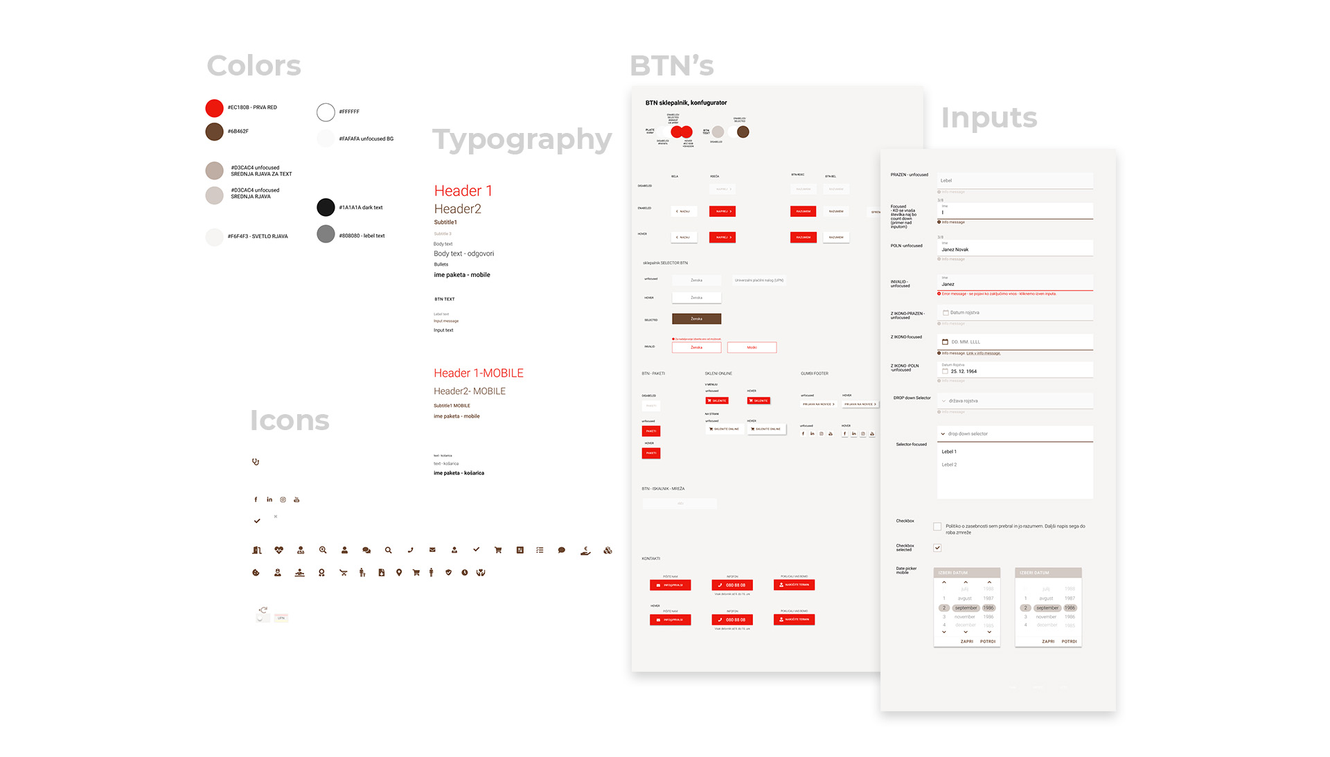
05 – Design system and visual language

The visual design built on PRVA's existing brand identity, translating it into a consistent digital experience across the website and insurance purchase process.

Typography, colours, buttons, form elements and other reusable interface components were defined to support visual consistency and usability.

Particular attention was given to creating clear distinctions between information, interactive elements and different stages of the purchase journey, while maintaining a recognizable visual language throughout the platform.

Responsive image

06 – High-fidelity interface design

The final stage focused on translating the established structure, wireframes and visual system into detailed interface designs.

The designs brought together product information, package selection and the online purchase process into a cohesive experience. Particular attention was given to maintaining a clear visual hierarchy, consistent interactions and straightforward navigation across different pages and screen sizes.

The resulting designs provided a consistent foundation for development, connecting the project's user experience goals with PRVA's visual identity.

Responsive image

Results

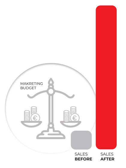
Following the launch of the redesigned Prva Zdravje website, the number of insurance policies sold increased more than sevenfold compared with the previous period, while the marketing budget remained unchanged.

This was an encouraging business outcome following the redesign, although the increase cannot be attributed solely to the UX/UI improvements.
Responsive image