PV | Work
PETRA VIDONJA

Husse

Seller Hub & Learning Platform

Bringing everyday business operations and online learning together in a unified platform for Husse’s seller network.

UX / UI DESIGN · SAAS · E-LEARNING

Responsive image

Project overview

CLIENT: Husse · via Gamabit d.o.o.
ROLE: UX / UI Designer
YEAR: 2022
PLATFORM: CMS dashboard · Online learning centre
FOCUS: User workflows · Information architecture · Interaction design · Cross-platform consistency

The challenge

The project aimed to transform Husse's existing online application into the Husse Global Team Centre — a more connected digital environment supporting everyday business activities, collaboration and learning across its European network.

The design challenge was to simplify key workflows, improve access to information and create a consistent, intuitive experience across the platform.

Beyond usability, the redesign was intended to support broader business goals:

  • Strengthen community and trust among team members working across different European countries.
  • Improve product knowledge and learning by making educational resources more accessible.
  • Support productivity and sales growth by helping team members work more efficiently.


Work process

01 - Understanding the product and its users

The redesign covered two connected parts of Husse's digital platform: Campus, an online learning centre, and a CMS dashboard supporting everyday business operations.

The initial work focused on clarifying the scope of both areas, understanding their users and identifying the main tasks and requirements. Campus was prioritized because it presented more complex requirements and was the client's immediate priority.


DEFINING THE SCOPE

Campus focused on learning content and training activities, while the CMS dashboard brought together operational tools and information for Husse's seller network.

Defining the scope of each area helped establish their different purposes and how they would work together within one platform.

Responsive image

02 - Research and analysis

Understanding the existing platform and the needs of its users provided the foundation for the redesign.

The analysis drew on project-manager discussions, available project materials, online research and an evaluation of the existing platform. This helped identify key user needs and areas where the experience could be improved.


Responsive image
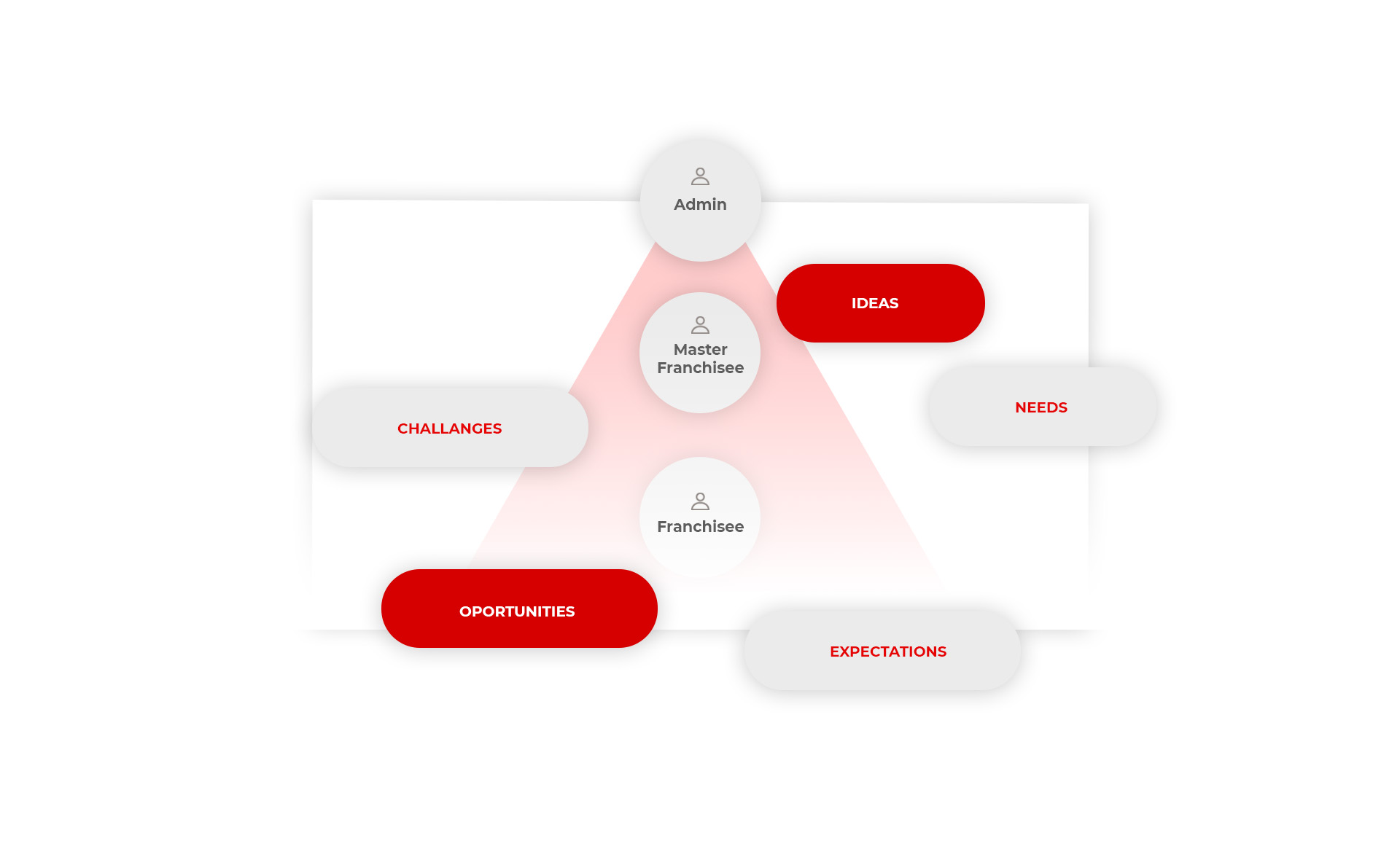
UNDERSTANDING USER GROUPS

Campus needed to accommodate users with different responsibilities, expectations and learning needs.

User profiles helped organize the available information about their goals, motivations and tasks, providing a reference for planning the learning experience and its key interactions.
Responsive image

03 - Designing the Campus experience

With the main user groups and requirements established, the focus shifted to structuring the learning experience around their needs and tasks.


FROM USER NEEDS TO TASK FLOWS

Task flows helped explore how users would navigate Campus, access educational content and complete their activities.

Mapping these interactions provided a clearer understanding of the screens and navigation paths needed to support different user goals.


TRANSLATING FLOWS INTO WIREFRAMES

The task flows provided the foundation for developing wireframes and exploring screen layouts, content organization and navigation.

Working at this level allowed the structure and usability of the experience to be considered before moving into visual design.

Responsive image
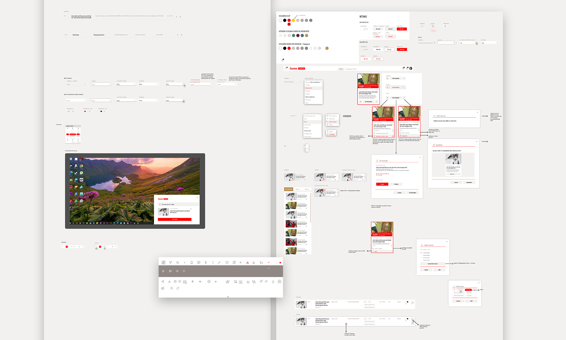
ESTABLISHING THE VISUAL SYSTEM

Husse's existing brand identity provided the starting point for a consistent interface language.

The design system brought together reusable interface elements, typography, colours and visual patterns, creating a foundation for Campus that could also be extended to the CMS dashboard.

Responsive image
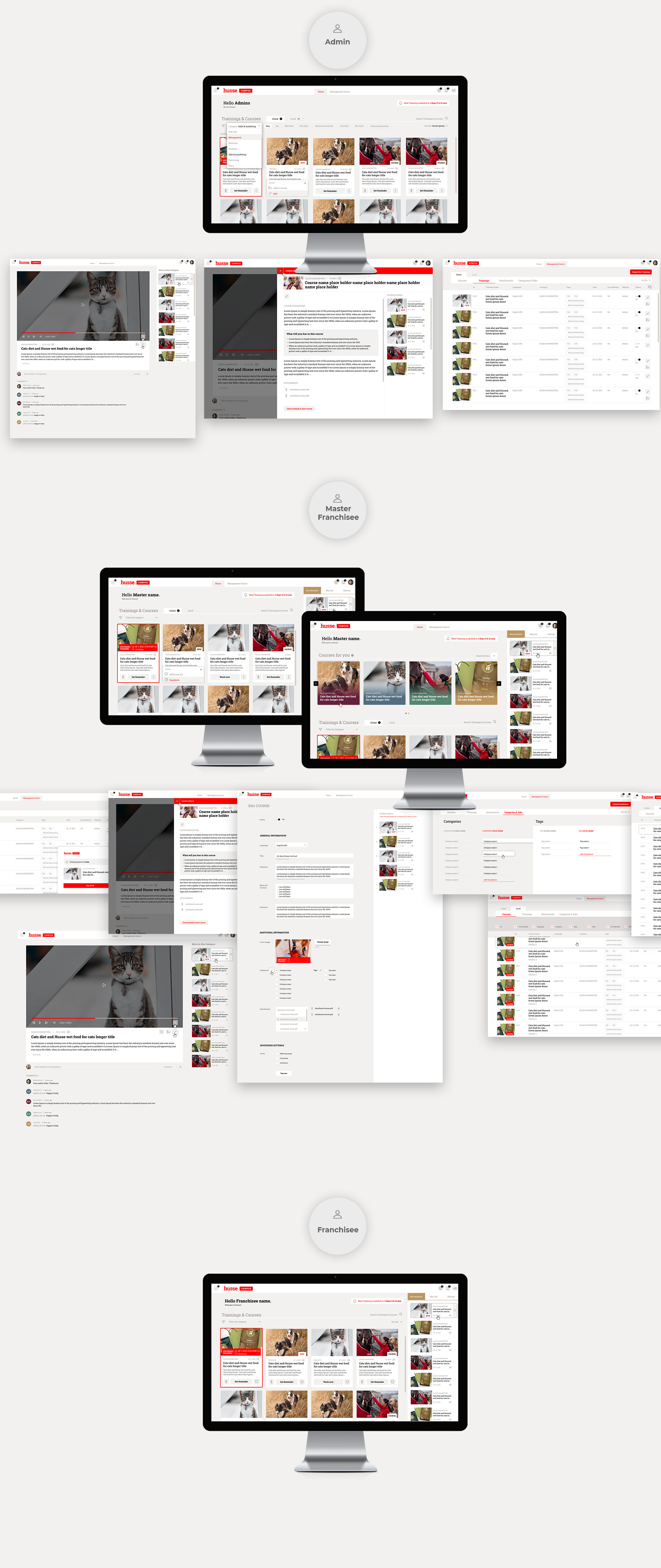
DESIGNING THE CAMPUS INTERFACE

The high-fidelity Campus designs brought together the planned navigation, content structure and user interactions.

The resulting interface aimed to make learning resources easier to access while maintaining consistency across different screens and user tasks.

Responsive image

04 - Extending the experience to the CMS dashboard

The second part of the project focused on the CMS dashboard, which supported Husse's seller network in managing everyday business activities and accessing information.

While the dashboard served a different purpose from Campus, both needed to feel like parts of the same platform.

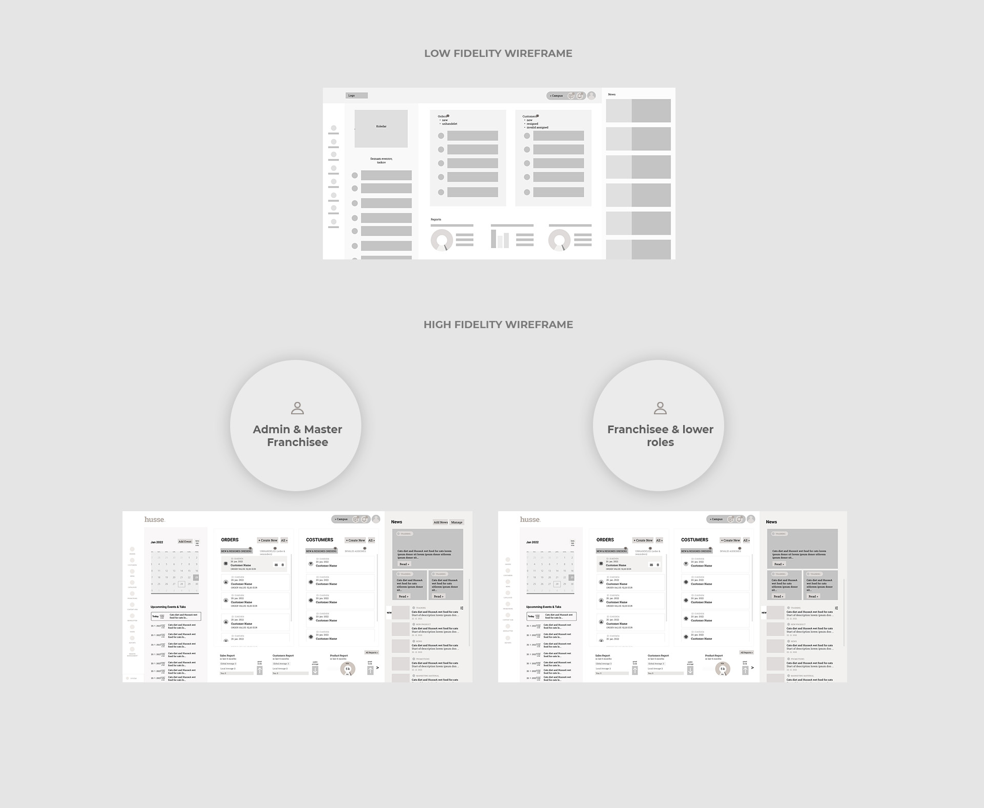
STRUCTURING THE DASHBOARD EXPERIENCE

I developed wireframes to explore how the dashboard's different functions and information could be organized into a clear, accessible interface.

The focus was on supporting everyday tasks while providing a consistent navigation experience and access to Campus.

Responsive image
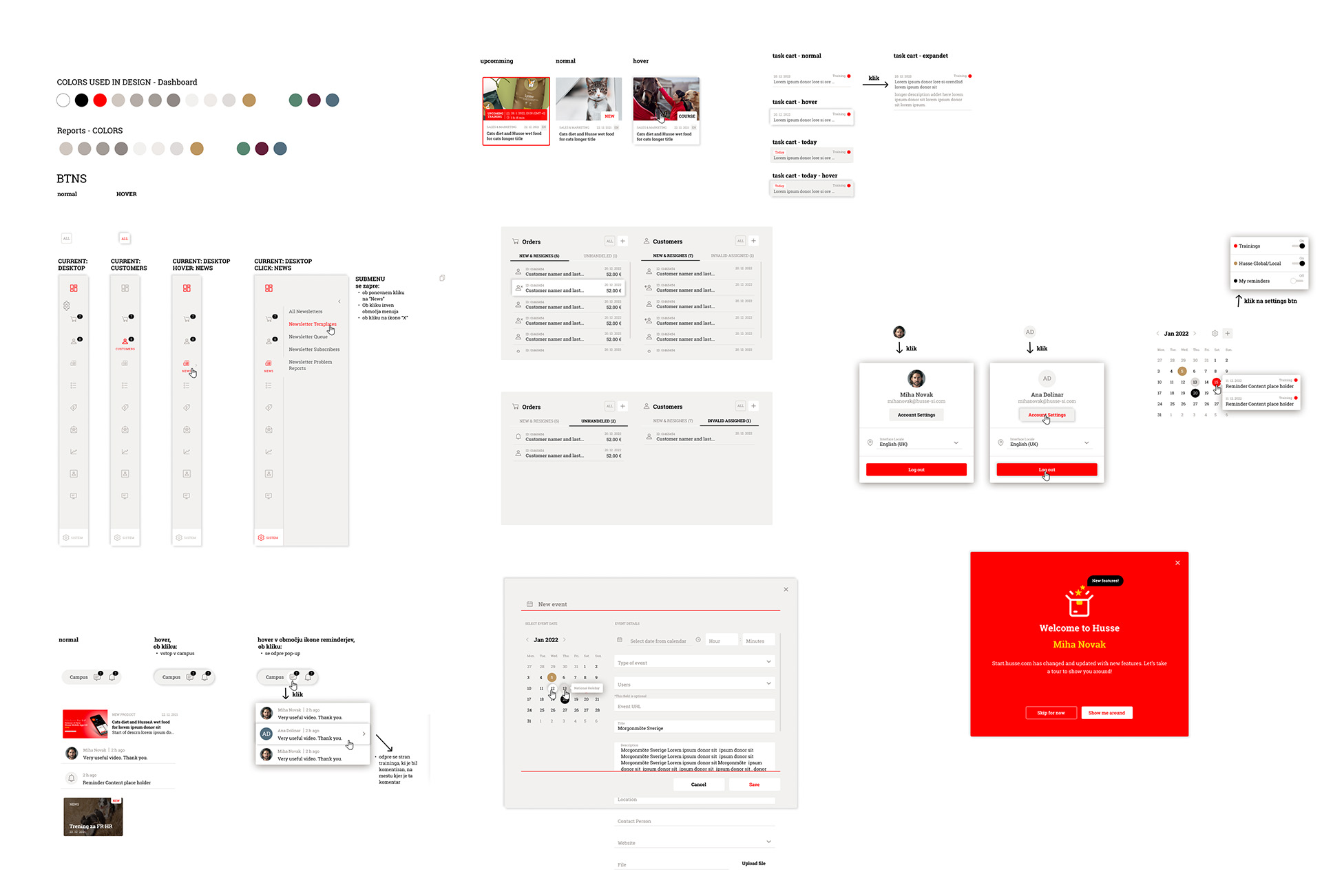
ADAPTING THE VISUAL SYSTEM

Rather than developing a separate visual language for the dashboard, I built on the design system established for Campus.

I reused and adapted interface elements to accommodate the dashboard's functionality while maintaining consistency across both parts of the platform.

Responsive image
DESIGNING THE DASHBOARD INTERFACE

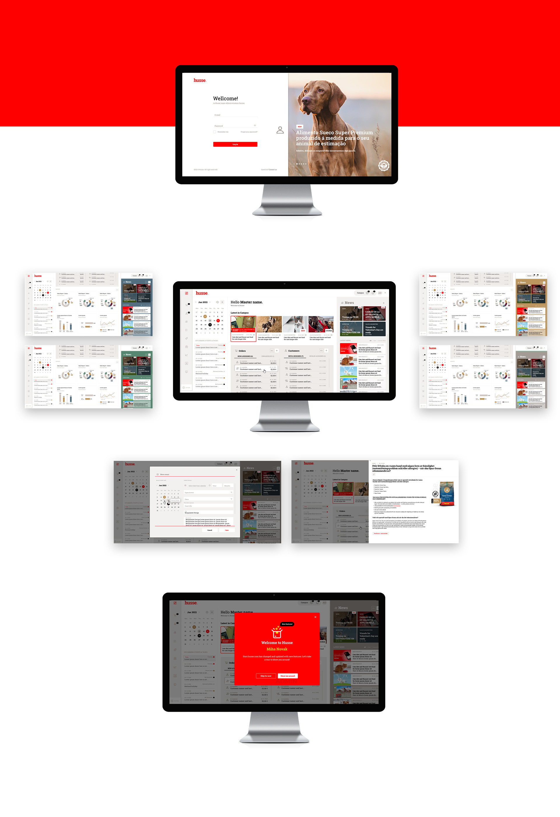
The final dashboard designs brought together operational tools, information and access to Campus within a unified interface.

By applying a shared visual language across both areas, the design aimed to create a more coherent experience for Husse's seller network, while supporting the different purposes of the CMS dashboard and the learning platform.

Responsive image

Customer opinion

Responsive image

Working on our projects with Petra was a very positive experience. She was very attentive to our needs, thorough in her planning and very consistent in delivery. We received a fresh perspective and functional ideas for our solutions that will be implemented based on her work. The final designs effectively integrate the needed functionality, a modern style, and the required graphic identity. Definitely highly recommend for any kind of UI and UX projects.

Nika Dajčman, Project Manager at Gamabit d.o.o.